Case Study | Arnebia
Expressive beauty range steeped in Swiss provenance
We were selected to modernize Arnebia’s VillaPhyta masterbrand while defining the positioning and visual identity for the Montreux sub-brand. Their products include daily creams, serums and elixirs to moisturize, tone and provide sun protection. VillaPhyta Montreux is steeped in provenance and natural ingredients and is manufactured for Arnebia in Switzerland.
Our Approach
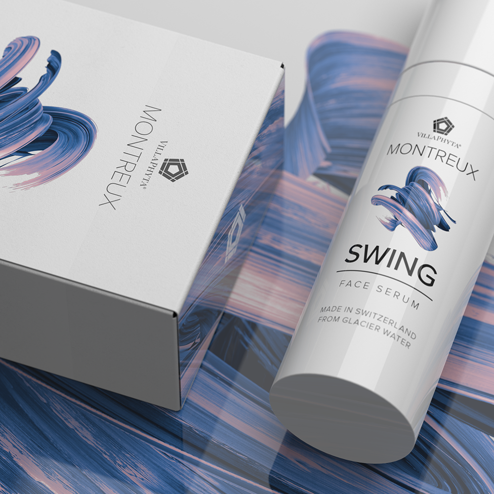
We took inspiration from the product’s Swiss heritage and the fact that Montreux is home to the world-famous Montreux Jazz Festival. So, the skincare collection’s product names took a musical theme including Solo, Cadence, and Swing.
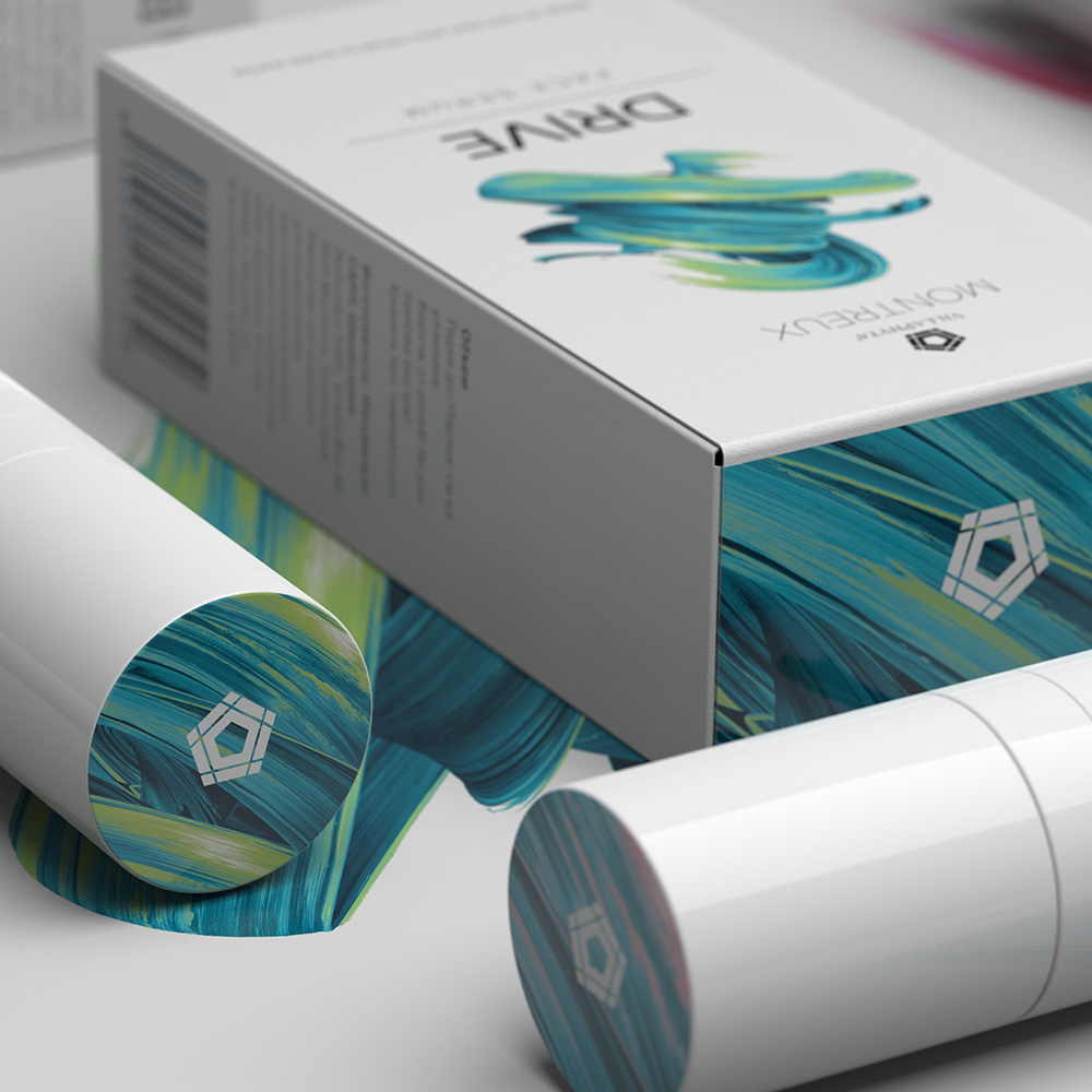
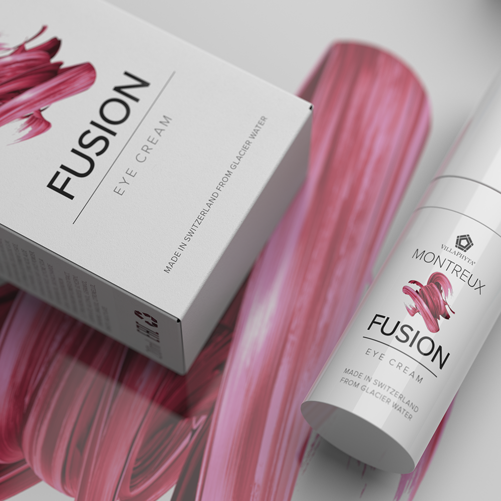
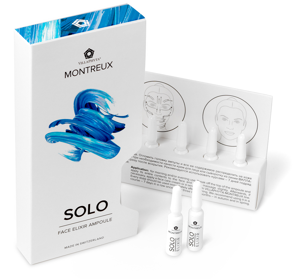
We felt a degree of expressive flair was crucial for the visual language, so we generated over a dozen early visual directions with varying degrees of personality. Working collaboratively, we developed a free brushstroke motif, representing the Montreux jazz theme, contrasted against a simple white Swiss-inspired canvas with precise typography.
In the range we included airless pump dispensers and ampoule droppers to enable the consumer to carefully dose the serums, which give an implicit accuracy association that’s fitting for a Swiss-made product.

The value we created
We created a distinctive and expressive beauty range that worked to premiumize the overall brand. We refined the masterbrand and logotype assets, building a clear sub-brand platform that helped transform consumer perceptions and elevate the positioning of a private label brand while driving growth.
Our client’s team was delighted with the resulting designs because the new brand direction matched closely to developing trends in the market. The Montreux range is now an important component of the Arnebia portfolio.
“We find that the CDP team is always responsive, creatively collaborative and strategically insightful. Working with them helps guide the end-to-end design process and I always look forward to our update meetings”